Navigation
Install the app
How to install the app on iOS
Follow along with the video below to see how to install our site as a web app on your home screen.

Note: this_feature_currently_requires_accessing_site_using_safari
More options
You are using an out of date browser. It may not display this or other websites correctly.
You should upgrade or use an alternative browser.
You should upgrade or use an alternative browser.
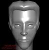
early character wip
- Thread starter crackhead
- Start date

Retrocide
Newbie
- Joined
- Jan 30, 2005
- Messages
- 84
- Reaction score
- 0
Could use a nose job, it looks too slim right now, spread it out a bit in the middle area and gradually get slimmer as it reaches the eyebrows. Most peoples nostrils are a bit visible from a frontward view. The lips could use a little definement, the upper part, looks too wide. Eyes are kind of small, and the neck should grow out with the head, I noticed at the jaw point that the neck goes from small to big and out. Other than that, looking good.

Retrocide
Newbie
- Joined
- Jan 30, 2005
- Messages
- 84
- Reaction score
- 0
About the lip, heres a reference to what I was talking about (Disregard the fact that its a Female reference.) http://img229.imageshack.us/img229/8197/show1ma.jpg The red area is what were focusing on, from the black lines, thats where I'm talking about. Even though you may not model the nostrils, it is still good to have the outline shape of it in the nose as shown in the picture.
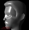
Your side view looks great except to where it hits the neck. http://img21.imageshack.us/img21/2922/10ix14pq.jpg In this picture, your render I made some outlines to help. Now unless your making Gman, you might want to define the face more. (Note the red lines.) the black lines are how your neck should form to look right. up in the nose, the red is where it should start, then as you get to blue it gets slimmer and then to where you have it now.
(These are very general drawings to my suggestions.)
crackhead
Newbie
- Joined
- Nov 25, 2004
- Messages
- 2,148
- Reaction score
- 0
oh thank you very much. yeah i sorted the lip thing i noticed that a while ago. im not making gman. maybe a young christian walken? but yeah hes supposed to have that sorta face hes like a high security guard type person. again thanks very much for those pics.
Retrocide
Newbie
- Joined
- Jan 30, 2005
- Messages
- 84
- Reaction score
- 0
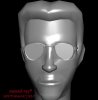
Yah, don't be afraid to spluge on detail on the head. An average head should have 1500-2200 Triangles if it has a face. Focus on the nose, eyes, and lips more. From what I see in Half-Life 2, the eyes are part of the face mesh, so you would fill in the space there. It seems you put a sphere in its place instead to indicate the eyes. Try to match the face frame you want using what is neccessary. No problem about the help, character modeling can be very difficult and time consuming.
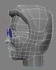
One thing I want to note, to get an even better look with fewer polygons or triangles, you might want to learn about flow. I'll demonstrate in the pictures here. http://img471.imageshack.us/img471/406/10ix17qm.jpg Thats your current model, notice how these lines are straight and arent exactly making use of the other polygons in forming.
In this picture this is how you can utilize them to have a much more natural flow http://img471.imageshack.us/img471/1194/10ix111yx.jpg .
crackhead
Newbie
- Joined
- Nov 25, 2004
- Messages
- 2,148
- Reaction score
- 0
thanks dude thats really helpfull. ive noticed some weirdness with the chin so i think im just going to delete the polys and make a new chin. if you recoment 1500 - 2200 triangles for a head how much do you recoment for a the whole body. im trying to use as few polygons as i can as i am capped to an export limit of 4000 polygons
Retrocide
Newbie
- Joined
- Jan 30, 2005
- Messages
- 84
- Reaction score
- 0
Well normally the way I do my character models. I distribute the Triagle throughout the body at a limit of 6500. I invest 1600 the most into the entire head, 1000 for each full arm (upper, lower, hands, and fingers.) and Full leg (upper, lower, and feet.) and the rest in the body. Alot of time you will find yourself increaseing or decreasing in each section depending on how your character is going to look like, you almost never get the desired limit.
Be sure that when your create the character, that it is going to be easy to UVW map, it is in the right pose for the bones, and easy to get to verticies when Wieght mapping it.
The reason for the pose, is becuase when the model becomes a physic model your want to get it as close to the idle or running pose. So when they die it doesn't look unatural.