Collapsible Quotes. Like it?

Chris D

Administrator
Staff member
Joined
Jul 1, 2003
Messages
11,927
Reaction score
231
Hey guys,

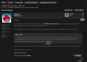
By the request of some community members over at the Official XenForo forums I created an add-on to XenForo which basically collapses quotes over a certain length automatically.

I've enabled this, but I just want to see whether you would like it to stay enabled or whether you don't much care for it.

I'm going to be switching carriers soon (again) and have to decide what kind of phone to get. There's two phones I'm currently teetering on, and thats the HTC Sensation 4G and the HTC Radar 4G. The Sensation will have Android 4.0 available to it by the time I'd be getting it, and the Radar is the Windows Phone OS. I can get the Sensation for $50, and the Radar for free with my contract. However the cost factor is negligible as I can get the Sensation from Best Buy, for which I have gift certificates which can bring the price down to like ten bones.

Currently I have the Incredible, which is a pretty good phone. The Android OS is feeling pretty tired now, and I love the way the Windows Phone interface is set up and how it works. However I dont want to hamstring myself in terms of capabilities. Lots of the videos I watch about the Windows Phone OS harp on and on about stupid shit like the social networking crap and how it links up with Xbox Live. I dont use my phone for that crap.

Its a phone primarily, and the extra functions are more... I guess you could call it "buisiness related". Things like GPS, calendar shit, email, taking photos that need to be detailed, video calls, taking notes and setting reminders, etc. Messaging is the most important thing for me though, and the default android messaging system (at least in 2.3) was crap. Complete crap. GoSMS is leagues better, but still not as good as I suspect it could be. I think Google Drive could have some sweet features once Google fixes their TOS.

So I guess I'm just wondering if anyone has experience with WP or Android 4.0, and can give me their impressions on those aspects, so I can better decide when the time comes. Thanks in advance.

As you can see, that is a long quote. There is a link in the top right to read more. When you click it, the full quote is revealed.

Shall we keep it? Or turn it off?
 
:eek:
This is really good, make the posts more clean, I think we should keep it.
 
Neat, I like it. Does it work with images as well? Not that its much of an issue these days, but I remember when people used to quote whole image posts in the image dump.

Also people should help me decide on a phone. ;)
 
If we do end up keeping it, I'll have to replace that arrow image, because goddamn.

The only thing that I would change about it is adding some kind of "..." where it parses.

It also messes up if you just use [quote.] without actually targeting anyone.
 
If we do end up keeping it, I'll have to replace that arrow image, because goddamn. If we do end up keeping it, I'll have to replace that arrow image, because goddamn. If we do end up keeping it, I'll have to replace that arrow image, because goddamn. If we do end up keeping it, I'll have to replace that arrow image, because goddamn. If we do end up keeping it, I'll have to replace that arrow image, because goddamn. If we do end up keeping it, I'll have to replace that arrow image, because goddamn. If we do end up keeping it, I'll have to replace that arrow image, because goddamn. If we do end up keeping it, I'll have to replace that arrow image, because goddamn. If we do end up keeping it, I'll have to replace that arrow image, because goddamn. If we do end up keeping it, I'll have to replace that arrow image, because goddamn. If we do end up keeping it, I'll have to replace that arrow image, because goddamn. If we do end up keeping it, I'll have to replace that arrow image, because goddamn.

Don't diss the arrows! :eek:
 
I like the idea but not how it's implemented. Any collapsed quote should have a big/wide arrow at the bottom center to click to expand. The location of it now in the top right isn't very intuitive.
 
Yeah, moving it would quite frankly solve both of the problems. It shouldn't be difficult to throw it in a div and align it with regards to the quote container.
 
Yeah, moving it would quite frankly solve both of the problems. It shouldn't be difficult to throw it in a div and align it with regards to the quote container.
Yeah ok, I'll configure that.
 
EHedb.png


Something like this? Arrows look pretty bad, but a wide tab like that is visible enough without taking up vertical space. I also think a gradient would really make sure that you can tell the quote is incomplete.
 
If we do end up keeping it, I'll have to replace that arrow image, because goddamn. If we do end up keeping it, I'll have to replace that arrow image, because goddamn. If we do end up keeping it, I'll have to replace that arrow image, because goddamn. If we do end up keeping it, I'll have to replace that arrow image, because goddamn. If we do end up keeping it, I'll have to replace that arrow image, because goddamn. If we do end up keeping it, I'll have to replace that arrow image, because goddamn. If we do end up keeping it, I'll have to replace that arrow image, because goddamn. If we do end up keeping it, I'll have to replace that arrow image, because goddamn. If we do end up keeping it, I'll have to replace that arrow image, because goddamn. If we do end up keeping it, I'll have to replace that arrow image, because goddamn. If we do end up keeping it, I'll have to replace that arrow image, because goddamn. If we do end up keeping it, I'll have to replace that arrow image, because goddamn.

I have implemented a temporary solution for quotes with no post/name supplied.

I will look at the suggestions by Vegeta now.
 
EHedb.png


Something like this? Arrows look pretty bad, but a wide tab like that is visible enough without taking up vertical space. I also think a gradient would really make sure that you can tell the quote is incomplete.

This is what I'm getting when expanding yours, Veg:

pTYVd.png


It's a cool effect but not very readable. Doesn't happen with the stock one.
 
Um. Huh? Is that a subtle joke?

Edit: Yorick beat me. I think she was joking.
 
EHedb.png


Something like this? Arrows look pretty bad, but a wide tab like that is visible enough without taking up vertical space. I also think a gradient would really make sure that you can tell the quote is incomplete.
Implemented some of this, Vegeta897, thanks.

I'm going to replace the text with some sort of image eventually, but this looks better for now. Hopefully you agree?
 
I hopefully do!

Nice work.

Edit: Will there be an option in the settings to always show full quotes?
 
I think the button could use a bit more padding, but I definitely like it.
 
So I guess the quote size criteria is based on character count?

m8srb.png


Hiding 5 words that would fit on the same line anyway is useless.

But, more importantly I would just like an option to disable this feature.
 
I'm still going to look at the user preference for disabling.
 
A disable would be nice. I hate collapsed quotes and find no redeeming value in them whatsoever, though you guys have done pretty well with the feature itself.
 
If you have a minimum font size specified in your browser the quote tab blocks the text of the post (collapsed AND un-collapsed). I'd recommend making the containing box wider to accommodate various font sizes instead of butting the edges right up against the text.
 

Attachments

  • Capture.JPG
    Capture.JPG
    83.2 KB · Views: 534
Bumping, are we leaving the quote tab able to overflow or is it being looked into?
 
CBA to read this entire thread so this has probably been said, but I like it. It looks nice and neat. It's quick and easy. I especially like it for those certain people who LOVE quoting the hugest biggest posts they can find and reply with "lol".
 
CBA to read this entire thread so this has probably been said, but I like it. It looks nice and neat. It's quick and easy. I especially like it for those certain people who LOVE quoting the hugest biggest posts they can find and reply with "lol".
lol
 
Hey guys,

By the request of some community members over at the Official XenForo forums I created an add-on to XenForo which basically collapses quotes over a certain length automatically.

I've enabled this, but I just want to see whether you would like it to stay enabled or whether you don't much care for it.


As you can see, that is a long quote. There is a link in the top right to read more. When you click it, the full quote is revealed.

Shall we keep it? Or turn it off?

This is pretty amazing! I do have to say you guys made a great choice from switching forum software's. I've never been part of a community using XenForo and I am really enjoying using it here.
 
The quote tab still overlaps the quoted text if you have a minimum font size specified ;)
 
Back
Top