First Map! - A few screens

MetalPiranha

Newbie
Joined
Dec 27, 2004
Messages
243
Reaction score
0
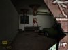
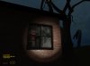
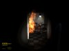
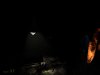
Ok here are a few screenshots of my first 'decent' map. I'm trying to get some work together to make a spooky 'zombie' style mod and this will hopefully, with some improvement be a part of it. Its a house, based on my own - which has been occupied, but zombies have attacked and now they rule the roost!

I need some help with modelling and a bit of coding though. I've got some cool ideas for this mod but i'm terrible at modelling so I can't really do much. If anyone wants to help out with this could you please give me your msn address? Cheers.

Take a look:
 

Attachments

  • 1.jpg
    1.jpg
    46.5 KB · Views: 381
  • 2.jpg
    2.jpg
    48.1 KB · Views: 316
  • 3.jpg
    3.jpg
    30.5 KB · Views: 310
  • 4.jpg
    4.jpg
    24.5 KB · Views: 314
its dark, small, and the screenies aren't too informative. It looks alright from what I can tell, which isn't much. Keep mapping and learn the secret art of displaying those maps. :thumbs:
 
I think the lighting needs to be lighter in some parts. if you want the player to rely on their torch, make some areas dark but keep others dimly lit. a good technique is to use flickering lights. I suggest that you check out DOOM 3 before you map some more, it should give you some excellent ideas. I think you can get a demo of ID's website.
 
The garage light is a flickering light. And yeh I did have doom3 but i got bored of it and deleted it :D
 
Bear in mind, that if a primary light source is a flickering light, I will be very annoyed when I play this map.....You have been warned :p
 
from the screens i guess you're goin for a kinda DOOM 3 feel to it...Still needs a bit more light - i think the first screenshot was more what you should do.
 
Well this was just like a practice map and its not at all finished. I can release it as it is if you want to see it.

Do i just need to post the BSP?
 
yes please!

yeah just the bsp unless u want ppl to steal the vmf and edit it themselves :|

my email is [email protected]

:)

i can be a tester if u like.

edit: have you got around to sending it yet?
 
MetalPiranha said:
Ah!

Sorry I forgot about this thread.

Smoke: A long time - since I'm currently working on a street map.

But here is the unfinished file! - http://www.review-planet.co.uk/hostedformates/home.zip

^ Lemme guess you want to see the half zombie get eaten by the barnacle. Immaturity at its finest :D

..........mebe............ :LOL:

edit: well........its nothin speacial........OMFG for such a small map its relitvly spooky, the lighting is awsome once u play the map, i know the screenies look dark,(they always do) but this map has sufficeint light to not be irritating, but just little enough not to nerf the spookiness.
that said, youve got a nice little map there and i suggest you finish it.

ps; is that the final size of the map? its not very big, mabye your home isnt a mansion like mine :LOL: but i suggest you increase the size and add floors to make it more interesting.

great use of decals and ragdolls btw,i also have 2 point out that the fire goes through the wall, and next 2 where it does, theres a brush thats not lined up :)


thanks for posting that little tast, and good luck!
 
Yeh. Cheers for the comments dude. I will finish it if my zombie/mutant mod finally starts. Perhaps you could help me... What are you into? Mapping, modelling, texturing, music?

Heres what I'm working on at the moment (In eerie light):

cornershop.jpg


And a classy zoom in :D

koke.jpg
 
The light tone is too generic, IMO. And it's a little bit took dark....
 
For which map? The first one? I understand but it was only my very first map :D
 
none too shabby my friend...none too shabby

i think it does look rather doom 3ish but that is just me...if anyone disagrees then i guess im a total idiot
 
Back
Top