Half-Life Poster

Poisongage

Newbie
Joined
Jan 7, 2010
Messages
18
Reaction score
0
Wanted to share this with you guys, something i made for fun.
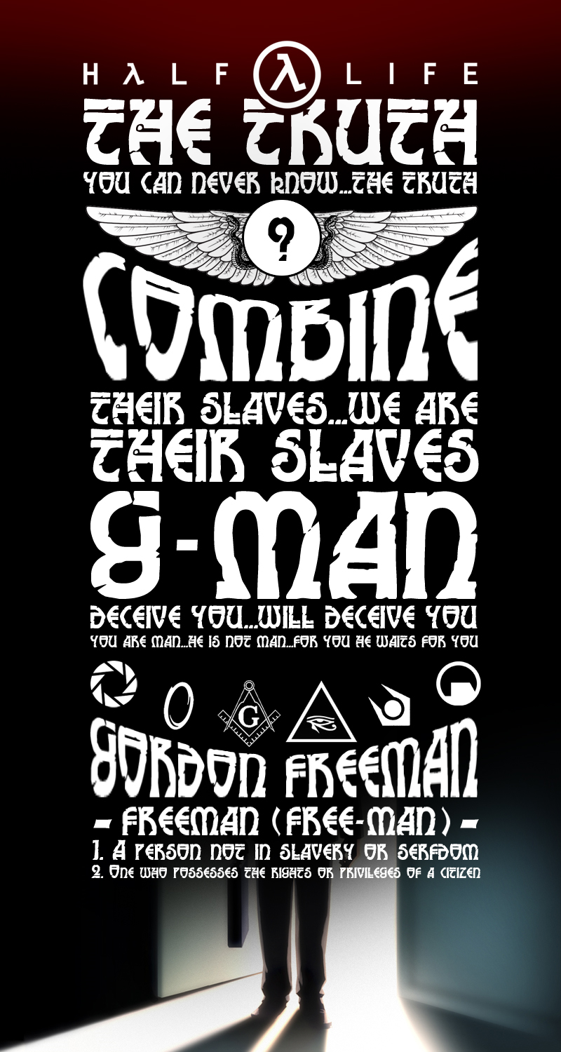
Half_Life_Poster_by_Poisongage.jpg


Hope you like it!
 
That's.... pretty cool actually.

Thanks! Much appreciated.

I thought this would be a good place to share this. Had a problem with HL2 that this community just helped me solve, so i guess this is my small contribution :)
 
It would be cooler without that weird-ass font. It looks so out of place and I don't understand why you chose it.
 
It would be cooler without that weird-ass font. It looks so out of place and I don't understand why you chose it.

Same. I like the design and concept, but the font doesn't really fit.
 
It's nice, but I also don't like the font. Looks like something you'll see outside a club advertising some bands/DJ's.

Did you make it for anything in particular or just for fun?
 
It would be cooler without that weird-ass font. It looks so out of place and I don't understand why you chose it.

so confused

Why are you confused ? :)

Same. I like the design and concept, but the font doesn't really fit.

It's nice, but I also don't like the font. Looks like something you'll see outside a club advertising some bands/DJ's.

Did you make it for anything in particular or just for fun?

Sorry to hear that you guys don't like the font, that's been what people liked the most about it up til now. I personally like it because it's ancient-looking and the message i wanted to convey with the poster kinda ties in with ancient history. But it's all good - people have different tastes.

I didn't make it for any particular reason other than i got the idea while drawing. I made it purely for fun. Anyways thanks for the comments, i can use the input! :)
 
This Poster
Nonsense. It doesn't make sense.
?
I Don't Get It
Redundant. Why is every line redundant.
Sentence Structure
Better. The sentence structure could be better.
Unclear (un-clear)-
1. not clear or definite; ambiguous
2. poorly stated or described;
 
I sort of get that it fits with the ancient vibe of what the text is saying, but it's taking it a bit far. It's just so cheesy looking. It's like using Papyrus.

Yeah, 1 comment about liking the font, at DeviantArt. *clap clap*
http://poisongage.deviantart.com/art/Half-Life-Poster-149395613

Well, your opinion is valued, input is always nice (good or bad). But i don't agree with the "cheesy" look though - i don't see how that is.

And i just recently uploaded it to deviantArt, as you can tell. The people i have showed it to have commented on the font, all in a good manner, until you guys shot me down :D
 
This Poster
Nonsense. It doesn't make sense.
?
I Don't Get It
Redundant. Why is every line redundant.

All the text are quotes from Nihilanth - they are meant to "set a mood" overall, not to make any particular sense by themselves. I can see what you mean, but if you don't get it, it's alright :)

I just shared it here to contribute a bit and to get some input - and i am glad that you bother to comment even though you don't like it .
 
We have lots of serious art types here at HL2.net so you'll be put under fierce scrutiny.

Also I'm the last guy you want to run into if you're a new member.
 
We have lots of serious art types here at HL2.net so you'll be put under fierce scrutiny.

Also I'm the last guy you want to run into if you're a new member.

I can tell :D

But then again, if you see this as a "lower-standard" than i guess i should be glad to take critique from a pro :thumbs:
 
The rest of the poster is pretty good, really the font is the only issue that really stands out.

Another problem with the font is that it's hard to read when it's used in the smaller size.
 
The rest of the poster is pretty good, really the font is the only issue that really stands out.

Another problem with the font is that it's hard to read when it's used in the smaller size.

Well thanks! I'm glad you like the design. But i'm still adamant about the font not being "bad" :)

I agree completely though, that the font is non-readable in smaller resolutions, but as far as i'm concerned, none of the text is too small to be clearly readable. None of the text is below 20px in size, which is where this font get's troubling to read.
 
All the text are quotes from Nihilanth - they are meant to "set a mood" overall, not to make any particular sense by themselves. I can see what you mean, but if you don't get it, it's alright :)

I just shared it here to contribute a bit and to get some input - and i am glad that you bother to comment even though you don't like it .

Ahh, well that makes a lot more sense. I only got to Nihilanth once and didnt recognize the quotes. It confused me since you seemed to speak English well enough in your replies, whereas the poster's English was, well, a bit alien.

I give this a 7.5/10 for Halflife Fan art. Its certainly better than most.

Also, I think this is one of the most active threads we've gotten in the art section in a long time. Usually days go by before anyone posts anything. So congrats on that too I suppose :D. And don't mind vegeta, he doesnt like any art that doesnt take months of 8 hour days to make (he is a pixel artist).
 
What are you doing here posting anyways? Don't you have 2013's artwork to get started on?
 
Why does the poster depict G-man if you quote Nihilanth? Other than that it looks kinda cool, but the font would work better for a rock band concert poster rather than HL2 fanart.
 
there seems to be a message hidden within the poster, a text pattern of some kind. not yet able to discern it. more research and we'll be able to crack this thing wide open.
 
So, is G-Man a freemason?

Haha i was wondering when anyone would ask about that. No. I am not implying that any single character has any connection to freemasonry or secret societies - but merely the symbolism of the "pun" that is the name G. Freeman. It's meant to hint at the fact that something beyond is going on in Half-Life - something that we cannot see through.

Ahh, well that makes a lot more sense. I only got to Nihilanth once and didnt recognize the quotes. It confused me since you seemed to speak English well enough in your replies, whereas the poster's English was, well, a bit alien.

I give this a 7.5/10 for Halflife Fan art. Its certainly better than most.

Also, I think this is one of the most active threads we've gotten in the art section in a long time. Usually days go by before anyone posts anything. So congrats on that too I suppose :D. And don't mind vegeta, he doesnt like any art that doesnt take months of 8 hour days to make (he is a pixel artist).

Well i'm glad you like my English :D

And thanks, i can see why it would cause confusion if you didn't recognize the quotes. And actually, i like that vegeta critiqued my work - artists always need "better" (for a lack of a more appropriate word) artists to tell them what they are doing right/wrong.

An MS Paint pixel artist, this is a very important detail.

I scoff at Photoshop/whatever pixel artists.

Hahahahaha :D Now i see.

Why does the poster depict G-man if you quote Nihilanth? Other than that it looks kinda cool, but the font would work better for a rock band concert poster rather than HL2 fanart.

Nihilanths words are the important bit, but they talk of everything but himself and his own race. "You are man...he is not man...for you he waits, for you"

Now i can't be 100% certain since my name isn't Mark Laidlaw, and my employer isn't Valve, but i am pretty sure Nihilanth was talking of the G-Man there, and the G-Man as a character plays a big role in what i wished to convey.

Also, the fact that you only see his feet and his briefcase stenciled out in the light of the portal door, is supposed to give you the feeling that you only know a fraction of what there is to know about the G-Man and the whole story of Half-Life.

About the font, like i said before, i chose it because of it's ancient look - you guys must have seen other work with this font in relation to these "rock bands" you speak of - cause i can't make that connection to be honest :D
 
there seems to be a message hidden within the poster, a text pattern of some kind. not yet able to discern it. more research and we'll be able to crack this thing wide open.

Oooh - mystery time :D

All jokes aside, you are actually on to something. The placement, layout and "shaping" of the text has some significance.

From the "All Knowing Vortigaunt": " That sharp spur of hope has not dulled to this day. For once the lesser master (Nihilanth) lay defeated, we knew the greater (the Combine/???) must also fall in time. "

This indicates that even the combine are below some unknown force, and thus Freeman/the human race can defeat them. In other words, the Combine too, are supressed by something bigger than them (notice the curbing of the COMBINE text in the poster below the winged sun disk).

I tried to make the placement and "look" of the elements reflect what is or may be the "truth" in the Half-Life series, a truth we will possibly never know, but at the same time, we recognize that there is something beyond.

If you didn't know these quotes, they are very interesting. Here are some more (taken from somewhere on this site):

***- " Your bright face obscures your darker mask."

***- " We call you sib, although your mind and meaning are a mystery to us."

*** - " Far distant eyes look out through yours."

*** - " Something secret steers us both. We shall not name it."

*** -" How many are there in you? Whose hopes and dreams do you encompass? "

*** - " Could you but see the eyes inside your own, the minds in your mind, you would see how much we share. "

The All Knowing Vortigaunt obviously hints at several things - both in-game and outside of the game.

One thing i have thought about, is a possible ending to the Half-Life series sometime in the future (or at least, the end of Freeman as a playable character) where Freeman would realize who his true masters are (us, the gamers).

Imagine this scenario:

Gordon realizes he is being controlled by an outside force (us, the gamers)
You are in first person view as normal, when suddenly, Freeman, out of your control, detaches himself from the first person view, steps forward and turns around, looks you in the eye and swings the crowbar at you (the gamer) ending the game. Now how about that.

I would take my computer apart, put it in my car, drive all the way up to seattle, park outside valve's office. Then I would stand outside my car for 5 days gathering the attention of all their employees. Then I would proceed to stomp the everloving shit out of my PC in their parking lot screaming profanities too horrible to post here. And once my computer is turned to dust and my feet bloody and mangled, I'd limp away, never playing another video game ever again.
 
I would take my computer apart, put it in my car, drive all the way up to seattle, park outside valve's office. Then I would stand outside my car for 5 days gathering the attention of all their employees. Then I would proceed to stomp the everloving shit out of my PC in their parking lot screaming profanities too horrible to post here. And once my computer is turned to dust and my feet bloody and mangled, I'd limp away, never playing another video game ever again.

That bad ? :D

I would be thrilled if Gordon freed himself of his true masters. Maybe that way of exposing it is "off", story wise, but still, i want Gordon to realize the truth at some point. Doesn't have to be in EP3 or HL3, but just before they cut the cord on the game series.

Spoiler: COMBINE WERE NEVER ON XEN

Spoiler: Nobody has ever been "on" Xen - it isn't a planet, is it ? :)
 
Mere quibbling! Marc Laidlaw confirmed that the Combine had not enslaved the Nihilanth and his 'people' and that they had never conquered Xen!
 
Mere quibbling! Marc Laidlaw confirmed that the Combine had not enslaved the Nihilanth and his 'people' and that they had never conquered Xen!

Well that's logic - the Combine did not "exist" in the original Half-Life, and it was the G-Man and his "employers" who conquered Xen by the help of Gordon. Nihilanth was the master of Xen (correct me if i am wrong) and when Gordon killed him, his slaves (the vortigaunts) were freed.

The Combine enslaved the Vortigaunts & the humans when they invaded Earth. That is why the vortigaunts are allied with the humans, so that they don't have to be subject to a new slave master.

But i'm kinda curious to know, if Nihilanth didn't talk about the Combine when he said "their slaves we are their slaves", then who was he talking about ? G-Man's employers perhaps ? But that wouldn't make sense, unless killing Nihilanth was just a test. And seeing as the Combine may not even have been thought of at the time of HL1, is there something we/I am missing here ? :)

Sounds like you know alot about the story, if you got more goodies/spoilers, please share :D

By the way, how'd you like the poster ?
 
Back
Top