HiT-SQUAD: Winchester 1300 Skin

M

Mailman

Guest
some work in progress action:
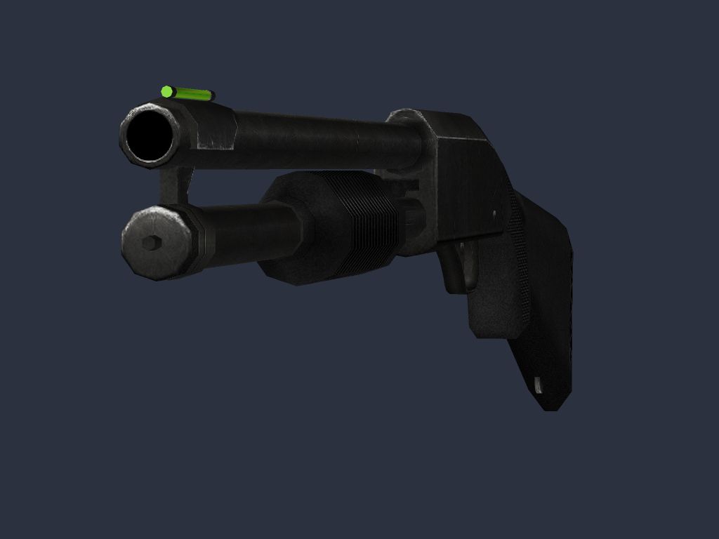
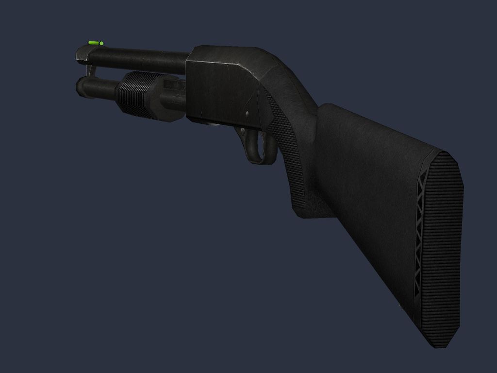
winchester_wip1.jpg

winchester_wip2.jpg

winchester_wip3.jpg
 
Looks nice. Though its a booring rifle, but that's not your fault :)
 
Man that is quite nice :)

I think your not rendering in perspective though. Kinda looks outta proportion in some shots, maybe im wrong im not sure.
 
Mailman hey its me cyborg. I think your renders would greatly benefit if they were to ge rendered on a much lighter backround. I can't make out much with that dark blue backround. Try a dark to light grey.
 
why are u using images in a user view instead of a perpective.....
 
Yeah, what exactly do you mean IchI?


I think what Mailman might be doing is taking a OpenGL shot from inside Lightwave instead of rendering out a picture. That could account for why the perspective might be off.
 
well. The best way to describe what I mean is when you look at an object that is long. It gets smaller in the distance. I think its called an orthergraphic view or something. With yours the model stays the same legth and things don;t get smaller in the distance unless they are actually smaller. Its basic science.
 
the skin looks very nice, even if it does look low res. the model looks like it has very few sides to that pumper.
 
its still a WIP, but its definatly a good start!
 
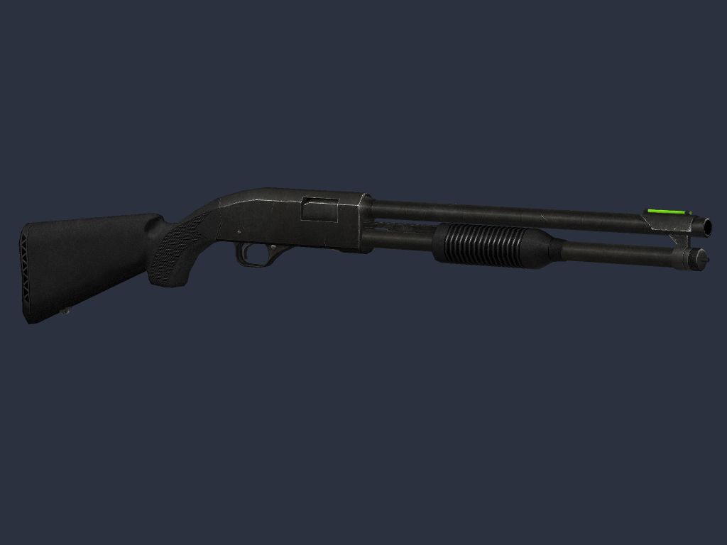
And now a shot with some perspective (pun intended, har har)

winchester_final2.jpg


These shots are taken in the modeller preview window. I suck at rendering.
 
ye it looks a lot better now. Its actually a really nice model and I like how your not making it really high polgon. To many people are making models with liek 2400polgons, When its not even needed. All u need are weapon models like the ones in cs 1.6 just with better textures and tweaks and its fine.
 
Originally posted by IchI
ye it looks a lot better now. Its actually a really nice model and I like how your not making it really high polgon. To many people are making models with liek 2400polgons, When its not even needed. All u need are weapon models like the ones in cs 1.6 just with better textures and tweaks and its fine.

Lol, and this is from the guy thats comments are usually...

"Not Enough Polies" lol, you crack me up....

I think a nice touch would be bits warn away on the bit where the pump slides along..... but that's just me, looks rather nice
 
Back
Top