Y
Yorick
Guest
The logo contest that we had recently received so many entries that we just spent the better part of a week sifting through them, discussing them all, and deciding which ones we felt would best represent us. I want to thank everyone who took the time to enter, I honestly was blown away with the talent and creativity that you guys displayed. I expected most of the entries to be MSPaint renders of stick figures with valves for genitals, and so on. But instead we got some really excellent images, several of which would have made excellent logos.
As is customary, let's start with the runners up...
In third place came Meko's design.
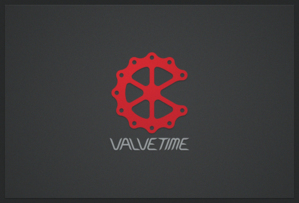
Meko actually wrote a bit about his logo, and why he made it the way he did, including a cute observation about Valve that I hadn't noticed before reading it. It's subtle and recognisable, and a great entry. Thanks Meko!
In second place came Aka's design.
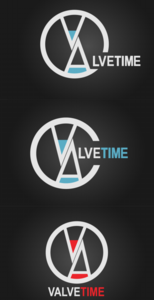
Aka's was, if I'm allowed to say, my personal favourite for a lot of the running. I liked the portrayal of it as an hourglass, and it is very sleek, clean, and sexy. The usage of blue actually made me consider doing a redesign of this site that would match the logo, rather than the other way around, that's how delicious it looks. Awesome stuff.
Now although he didn't win, I feel like I have to give an honourable mention here to Tinckerbell.
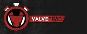
He did some really fantastic designs and was very open to trying different things, and offered a lot of feedback to other applicants and basically just took a very large role in the entire thing. We weren't planning on having any kind of award for this, but I think we're going to make a special case and throw something together.
And finally, in first place we have Voythas!
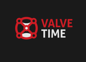
This will be the new ValveTime logo that will be appearing on our website, facebook, youtube, whatever else as soon as I get around to making that happen (which I assume will be sometime this weekend). The inclusion of the hourglass within the Valve itself is something that I love, and I think it will do a great job of representing us.
Prizes will be going out within the next couple of days. Again, I want to thank everyone who participated. Stay tuned for our next contest coming soon. Since we've already given out prizes for taglines and logos, maybe we'll just cut out the middle man and bribe you guys to moderate the forums yourselves.
As is customary, let's start with the runners up...
In third place came Meko's design.

Meko actually wrote a bit about his logo, and why he made it the way he did, including a cute observation about Valve that I hadn't noticed before reading it. It's subtle and recognisable, and a great entry. Thanks Meko!
In second place came Aka's design.

Aka's was, if I'm allowed to say, my personal favourite for a lot of the running. I liked the portrayal of it as an hourglass, and it is very sleek, clean, and sexy. The usage of blue actually made me consider doing a redesign of this site that would match the logo, rather than the other way around, that's how delicious it looks. Awesome stuff.
Now although he didn't win, I feel like I have to give an honourable mention here to Tinckerbell.

He did some really fantastic designs and was very open to trying different things, and offered a lot of feedback to other applicants and basically just took a very large role in the entire thing. We weren't planning on having any kind of award for this, but I think we're going to make a special case and throw something together.
And finally, in first place we have Voythas!

This will be the new ValveTime logo that will be appearing on our website, facebook, youtube, whatever else as soon as I get around to making that happen (which I assume will be sometime this weekend). The inclusion of the hourglass within the Valve itself is something that I love, and I think it will do a great job of representing us.
Prizes will be going out within the next couple of days. Again, I want to thank everyone who participated. Stay tuned for our next contest coming soon. Since we've already given out prizes for taglines and logos, maybe we'll just cut out the middle man and bribe you guys to moderate the forums yourselves.
