Sourced: Community high-res texture set for HL: Source

d'keesto said:
example1.jpg
example1b.jpg


That looks great, but shouldnt the bottom half look more blueish?

BTW - when will any textures be available to test for ourself?
 
Besli said:
Yeah, that's great! Can you now make the complete set of elevator buttons? Would be great!

Already done and sent to d'keesto. I was just posting a sample here. Although i'm taking another whack at it to be more true to the original

Also, thanks for that mapcore link. I've been taking screenshots of them in hammer to get the originals which is a bit more of a pain.
 
azz0r said:
That looks great, but shouldnt the bottom half look more blueish?

BTW - when will any textures be available to test for ourself?

It does when I don't shine my flashlight on it. That screenshot comparison was poor on my part, because the original and replacement have completely different lighting on them.

Well, I have a running setup of all completed materials for the game. I can periodically release the incomplete version of the mod for those who want to take a look. At this point, only about 3.5% of the textures are done, so I don't think it's quite worth it. You'll have to play through the whole game just to see a few updated textures.

Maybe in a week.
 
Besli said:

This is helpful for comparison, but please keep in mind, these textures are from the original, not Source. The texture dimensions and ratios are different than many of the Source textures because the original game did not require power of two dimensions.
 
sdether said:
Already done and sent to d'keesto. I was just posting a sample here. Although i'm taking another whack at it to be more true to the original

Also, thanks for that mapcore link. I've been taking screenshots of them in hammer to get the originals which is a bit more of a pain.
Ah, that's good!!
No problem for the link! ;)
 
You know, if I have time, maybe I'll set up the same sort of thing with the new texture dimensions. It'd be nice to have them in a Windows folder with all the thumbnails. Much more convenient. It's a step that would have to be done anyway.
 
Pi Mu Rho said:
This is used so few times in-game, that I'd replace it with a prop.

I'm not sure what you mean by that. What would the benefit be? Can that be done without editing the map file?
 
Looks great, but the green is still bothering me. Um, don't be surprised if that button is orange in the final release.
 
sdether said:
Ok, i swear, i'll move on to a new texture set now :)
elevator_old.jpg
elevator_new3.jpg
Wow, that's the best one!! :thumbs:
I think the green color isn't as bad!!
 
It'd look better if it was modelled, textured and rendered.
 
I don't know.. the green ball looks too.. ball-y. It's supposed to be an indentation with lights that highlight it, it looks too weird to me. Maybe it looks better when it's shrunk to the proper size.
 
i don't really have time to do a full texture set but i gave one texture a try, sorry the image is a bit big, what do you guys think?: (it's only a toutch up not a full remake)
old-new.jpg

old on the left, my remake on the right.
 
it's 4 times the res of the old one it's just i scaled the old one up so they were more comparable
 
Well, it looks like you just scaled up the original and increased the contrast. It won't be any less blurry in-game than the original.
 
indeed, you have to fully remake it, higher ress doesnt mean shit if you just resized the old one.
 
Hi guys, new to this forum and saw this really cool, exciting project - so I thought I'd try and chip in...

I didn't download the .wad etc. as I want to make sure this is good enough first.

Old
+amedkit-1.jpg


New
+amedkit-1b.jpg


If you like it I will continue, and do this in the 'on' position aswell.

Cheers and I look forward to hearing your comments.
LG
 
LimeyGeeza said:
Hi guys, new to this forum and saw this really cool, exciting project - so I thought I'd try and chip in...

I didn't download the .wad etc. as I want to make sure this is good enough first.

...

Cheers and I look forward to hearing your comments.
LG

Looks great.
 
Sorry for the lack of updates the last two days everyone. I've been working on a huge texture set of concrete pieces, so there's nothing to show for it yet.

Also, I'm setting up a website for this project. I think that will attract more people to contribute, because the information will be in one accessible place where you don't have to navigate through all these pages of posts. I'm also going to use the website to release these texture groups in small zips of jpegs. That'll make it far easier to contribute. You won't have to go through all my convoluted directions.

I'll post info about the website once I get it hosted.
 
LimeyGeeza, I'd love to have you contribute to the project, these look great!! That being said, some are unusable, because you based the dimensions of the HL wads instead of the HL:S power of two vtfs.

I would say wait for the website to go up, or email me ([email protected]) which texture names you want to do, and I'll send you the correct dimensions.

Here are my critical comments:
The med station looks just a tad cartoony, while we're going for photorealistic. If you kept the same photoshop file and just changed the texture layer to utilize a photo of metal, I think you could get that look.

Those dials and buttons truly look photorealistic. Those are awesome. They just need to be a little more yellow and less orange to match the original color.

In the last one, the blood looks like paint because it's not dark enough. You also omitted the chrome border around the whole sign.

But, wow, these are fantastic!
 
d'keesto said:
LimeyGeeza, I'd love to have you contribute to the project, these look great!! That being said, some are unusable, because you based the dimensions of the HL wads instead of the HL:S power of two vtfs.

Comments noted and appreciated...

I totally want to contribute and will wait till you have some more of this stuff organized. I know some are the wrong size - due to me using the original HL textures from the mapcore site (I don't have Hammer installed yet) - so once we get a little more sorted - I will re-do some of these and others - exciting stuff - cool to be involved.

Cheers
LG
 
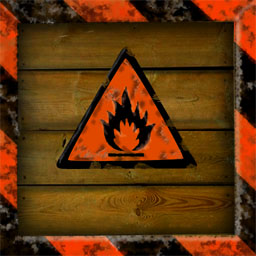
Currently redoing all the crates.. Must have nice crates to smash.. Here's a work in progress:

bcrate09a.old.jpg
bcrate09a.new.jpg
 
LG, you won't need Hammer once I get the site up. I'll start posting the originals as jpegs in zip files that include only the set of textures that go together. A limited number will be available at a time, so I hope Valve doesn't have a problem with it.

Sdether, looking pretty good! I suggest making the flammable logo look painted onto the wood, though. It looks like an embossed metal plate. I realize the original looks that way a little bit, but I've never seen a crate marked that way in real life. The border looks somewhat un-woody too.

Here's some of what I'm working on:
ex6.jpg
ex6b.jpg
 
d'keesto said:
LG, you won't need Hammer once I get the site up. I'll start posting the originals as jpegs in zip files that include only the set of textures that go together. A limited number will be available at a time, so I hope Valve doesn't have a problem with it.

Are you kidding me - we're doing Valve a favour! :D

Sounds good though d'keesto - do you have an ETA for this?

LG
 
ETA is totally dependent on number of contributors, which I expect will increase with the website. With two or three more regular contributors, I expect it to be done in about ten weeks.

As of now, I have completed 142 myself in a week and a half. (I count all files that need to be replaced, so some are repeats of the same texture.) I am spending more time on it than most people probably have. When school starts for me in mid-January, I'll have to cut way back, but hopefully a few more people will have signed on and it'll almost be done by then. There are about 3200 total textures.

ex8.jpg
ex8b.jpg
 
a couple textures

Hi there i made three textures for submission if you want to have a look at them.


+1c3a1_nrc1.png


+0c3a1_nrc1.png


sign_loader.png
 
Hey LimeyGeeza nice textures! But the health charger texture looks too much like plastic, it should look more like metal!
Very nice crate texture sdether, can't wait to see the rest of them!
Very nice wall textures d'keesto!!

Originals:
+0medkit.jpg
+0c3a1_nrc1.jpg


Remakes:
medpack.jpg
screen.jpg

(medpack remake by mikezilla,
access screen remade by MrH2o)
 
Heres a re-do, after comments - (might still not be the right size, but I have at other resolutions too) -

d'keesto - I meant an ETA for the webpage with the HL: Source texture sizes - not the whole project :D

Personally I have more fun doing the dials, control panels, signs etc for Textures...so thats what I'd like to concentrate on.

Clean '0' position:
HLfirstAidV2.jpg


Dirty '0' position:
HLfirstAid3.jpg


Dirty '+' position:
HLfirstAid3on.jpg


The old texture is quite 'dirty' when you look at it, the Black Mesa Janitors must have been lazy buggers.

LG
 
Back
Top