Sourced: Community high-res texture set for HL: Source

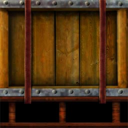
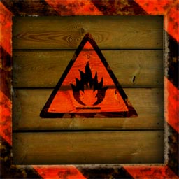
More crate update samples:
crate03.old.jpg
crate03.new.jpg
bcrate09a.old.jpg
bcrate09a.new2.jpg
 
I want to say something in regard to wood, i was working at a warehouse for a couple years and the most common logistical wood types are very light coloured and never treated in any way, mostly rectangular in shape, it burns very short and is mostly usable for igniting/warm up wood. Its the cheapest and least wanted wood so its used for logistical pallets and crates. But when used over and over again they begin to look darker. The explosive one looks like a couple treated planks for porch/home applications. Im just making a realism statement, im not saying that anyone that has made Half-life crates are bad artists. Regular unmarked non lab crates can look dark, but marked cases should look light to reflect they contain medical/scientific supplies/sensitive equipment.
 
I actually started with pictures of pallette wood to create the crates. And that wood is very light in color. Similar to the crates you find in Half Life 2.

However, my goal with these crates is to create high-res versions of the originals from the game. As such the tinting may not be realistic but rather true to the original. The "making Half-Life realistic" angle is being undertaken by the BM:S folks, and I think that's appropriate, because if you really want to make it look realistic, you gotta go back and change the models too, since everything is quite low poly count in HL.
 
sdether said:
I actually started with pictures of pallette wood to create the crates. And that wood is very light in color. Similar to the crates you find in Half Life 2.

However, my goal with these crates is to create high-res versions of the originals from the game. As such the tinting may not be realistic but rather true to the original. The "making Half-Life realistic" angle is being undertaken by the BM:S folks, and I think that's appropriate, because if you really want to make it look realistic, you gotta go back and change the models too, since everything is quite low poly count in HL.


I totally agree sdether your textures look pretty true to the original - I think we need to establish what we are going for here - keeping as true to the original textures as we can (some are pretty 'cartoony') - or going as photorealistic as possible - I think we can find a pretty happy medium between the both though.
 
A little off topic but thought you guys might find this interesting:

Original Half Life Compared to Half Life: Source Compared to Blue Shift High Def Pack

http://alyx.angsthase.info/index.xml

It'd be cool if we can get the Blue Shift Models into our Mod too...but that may be a whole nother kettle of fish.

LG
 
My approach to the textures has been:

Imagine that the image you are looking at is a thumbnail of a close to photorealistic, if not "real" picture. And we're trying to add the detail back that was lost when it was minaturized.

As for the Blue Shift Models, there is already a thread regarding that effort here. Personally, i look forward to installing this and the Blue shift conversion mod together and playing HL once more :)
 
sdether said:
My approach to the textures has been:

Imagine that the image you are looking at is a thumbnail of a close to photorealistic, if not "real" picture. And we're trying to add the detail back that was lost when it was minaturized.

As for the Blue Shift Models, there is already a thread regarding that effort here. Personally, i look forward to installing this and the Blue shift conversion mod together and playing HL once more :)


Yeah, that's the approach I'm looking for. For instance, with those med stations, I think a compromise between clean and dirty is needed. The textures sure don't seem dirty in the game unless you really study them, and I'm not sure that's what they were going for cause it would be so unrealistic. I think with the low res textures they were using, certain details had to be exagerrated to show up. For example, if you look at that cracked concrete texture I did, the crack would be too thick if it were the same thickness as the small version blown up.

Aleks, I emailed you some comments. The only other thing I would add is that there's a little too much glare added here and there on the textures. It will look odd when combined with the lightmap in the game. Also, you missed a third version of that computer screen which doesn't have the red writing.

As for the website, I sent the request to PlanetHalflife on Thursday and am awaiting a response.
 
Here is an in-between - not so clean not so dirty... :rolling:

Also a new one....

HLfirstAid4on.jpg


Old
c3a2sign00.jpg


New
c3a2signb.jpg


LG
 
Wow LimeyGeeza the dirty one is really nice!! and the new one is very good too!! The HL logo looks also very great!!
 
Nice LimeyGeeza, maybe you could use the dirty one in the industrial areas and the not so dirty not so clean one in like office complex and populated areas...
Although the lambda symbol looks a tad too dirty, the lambda complex is still the newest part of BMRF.
All these textures look great, so looking forward to playing this mod whenever it comes out.
 
Some VERY Killer work here guys & gals, really supurb stuff. It would be awesome if you could complete this project here, it would be awesome.
 
What kalash said, would love to have you guys on our team to combine this with all of our work :)
 
This is fantastic work guys. Can't believe i only just found it!!! :D


Nice... seriously nice. :)
 
jheaddon said:
What kalash said, would love to have you guys on our team to combine this with all of our work :)

I'd definitely be interested in contributing to Black Mesa: Source. But I'm commited to finishing this project first. But I'd love to try converting some of my textures to diffuse versions with normalmaps.

More motivation to get this project done quickly!

I'm still waiting for a reply from PlanetHalflife. :frown:
 
PHL have a nack of not replying, although some of the guys over there are really nice, if it's about hosting or a news post then try asking this guy:

[email protected]

Always helped me out :)
 
I'm with d'keesto on the BM:S angle. There is nothing i want more than a re-imagined HL in Source, but i see that being a slow process to do right and before that happens i want to just play HL again in high res textures, so i'd prefer having this finish as quickly as possible, then maybe move the resources and artwork over to the BM:S project
 
It's at 169, but some of the ones you see posted here haven't been finally submitted yet.
 
d'keesto said:
It's at 169, but some of the ones you see posted here haven't been finally submitted yet.

Yeh - just waiting to get the right sizes before I officially submit - most of the ones I have done at a higher rez - so it's just a case of scaling (I hope).
 
Could really use you guys, but upto you. We do cater for needing time on more important issues, and you can really take your time if you want.

Upto you though :)
 
Hey, LG:
Do you make this textures from scratch? And, if so, what program, and how? They look beautiful!
 
BetaMaster said:
Hey, LG:
Do you make this textures from scratch? And, if so, what program, and how? They look beautiful!

Yeh all from scratch - I use real images as reference for textures etc. where I can. All done using Adobe photoshop.

Thanks for the props!
 
This looks great when will there be a mod with textures for the whole game?
 
Some of these textures look even better than some of the Half Life 2 ones...
 
So you all know why I haven't done new textures recently, I've been figuring out how to convert all the original vtfs into jpgs, so you can view them in Windows instead of Hammer. This will save tons of time taking screenshots and carefully cropping around the originals. I finally got it to work, so now I'm organizing them by sets.

Still waiting on getting hosted.
 
d'keesto said:
So you all know why I haven't done new textures recently, I've been figuring out how to convert all the original vtfs into jpgs, so you can view them in Windows instead of Hammer. This will save tons of time taking screenshots and carefully cropping around the originals. I finally got it to work, so now I'm organizing them by sets.

Still waiting on getting hosted.


This will be awesome - it'll make it a lot easier - just watch the textures flood in when you get this done!
 
Will be complete hopefully by the end of January, but I cannot predict without know how many will sign on when the website is up.

ex9.jpg
ex9b.jpg
ex10.jpg
ex10b.jpg
 
I know this may be asking too much, but could you post some ingame comparisons

thanks
 
I'd like to participate if possible. Here's a sample:


out_wall6sm.jpg
out_wall6.jpg


If it's up to par, tell me and I'll finish the rest of the series.
 
That looks great. Now there's a texture that would benefit from normal and bump mapping and recompiled lighting.. Pity we don't have an option.

Only suggestion, from looking at the original, it seems the surface coloring should be a little less uniform.
 
Looks fantastic - with this many of us participating - we should be done in no time...

d'keesto - any word on the website yet? I'm itching to get started with the right sizes? - Shall I just 'pm' you with the sets I'd like to do and you can give me the sizes?

Let me know

LG
 
Cool. I finished up most of the set since they're all really similar. Just 2 more to go. This one turned out pretty nice I think.

out_wall6c2sm.jpg
out_wall6c2.jpg
 
Looks great.

LG, just PM me the sets you want to do, and I can email you zips of the jpegs.

Still no word on the website. I've submitted requests to two different hosts.
 
I am sure I could swing something by the owner @ leakfree, see if he would be up for it. I'm sure he would be, just need to double check.
 
Those are looking awesome!!!

Oh and the mod team I'm on is hosted by HL2Files.com... It can get you on FileFront and a bunch of other worldwide mirrors VERY fast, and it would make distribution of the high-res pack later on MUCH easier... We've had no problmes with them :)
 
Back
Top